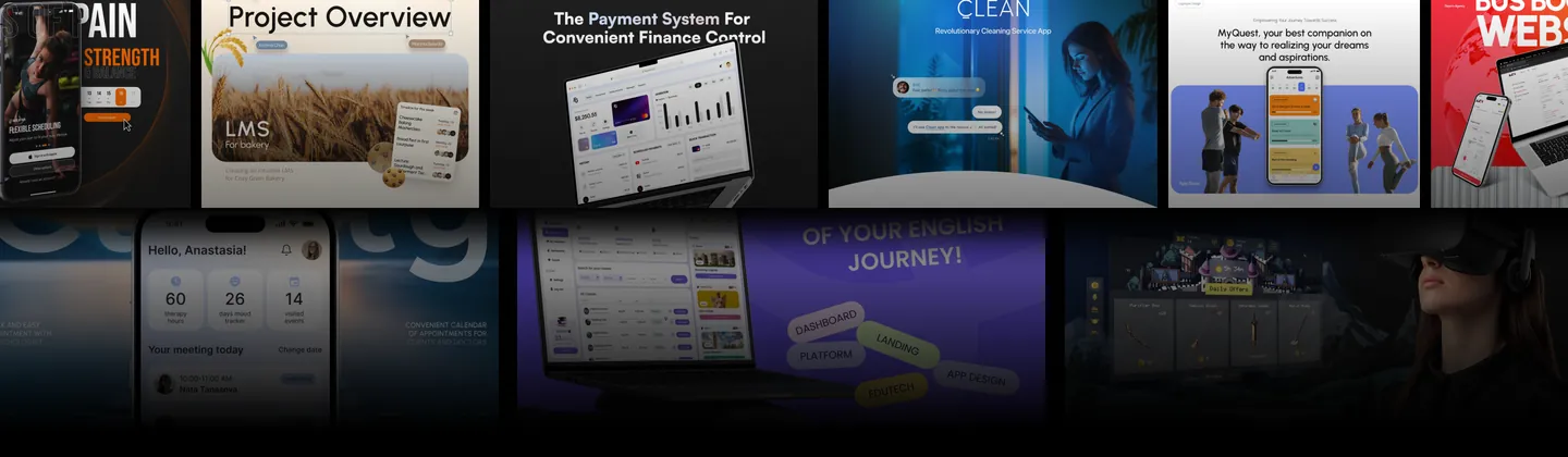
 Product & design team
The old site talked to players.
Its buyers sign six-figure contracts.
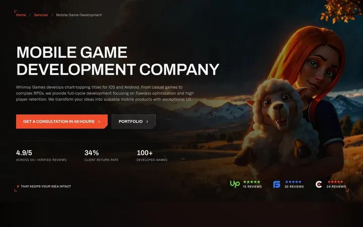
Whimsy Games builds mobile, PC and console games for publishers, founders and brands. We redesigned its website, from the home page to seventy service pages and the brief, to look like a studio and talk like a partner.
What the new site is built around
- routes from the first screen
- 2
- service pages, five groups
- 70 pages in 5
- to a scoped estimate
- 48 h
The new site is in development · brief starts and estimate requests will be read after launch
Service
UX/UI design & CRO
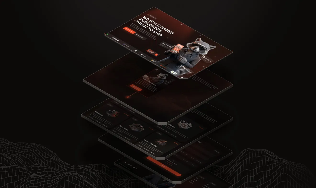
The new home page taken apart: the first screen, services, the production process, the brief and the footer, each one layer of the same scroll.
- Client
- Whimsy Games
- Industry
- Game development · B2B services
The client
A full-cycle game studio with a hundred shipped titles
Whimsy Games makes mobile, PC and console games and game art: whole projects, art production, co-development and live ops, for publishers, studios, founders and brands.
- years in the game industry
- 8+
- games shipped
- 100+
- clients
- 89
- specialists in-house
- 75
- What we were asked for
- A site for the studio’s new offers. An offer audit had just redrawn who buys, and why the best deals were lost.
- Pages
- Home, projects, portfolio, case studies, seventy service pages, about, team, blog, careers, contact, FAQ, search and a 404.
- Platforms
- Desktop at 1440. Home, menu, services, a case study and the brief also drawn at 390.
“Avoid anything simple, typical or template-like.”
Translated from the client’s Ukrainian brief. The client named two studio sites as the bar to clear, both strong on structure and real game art.
Where we started
The old site played the wrong game.
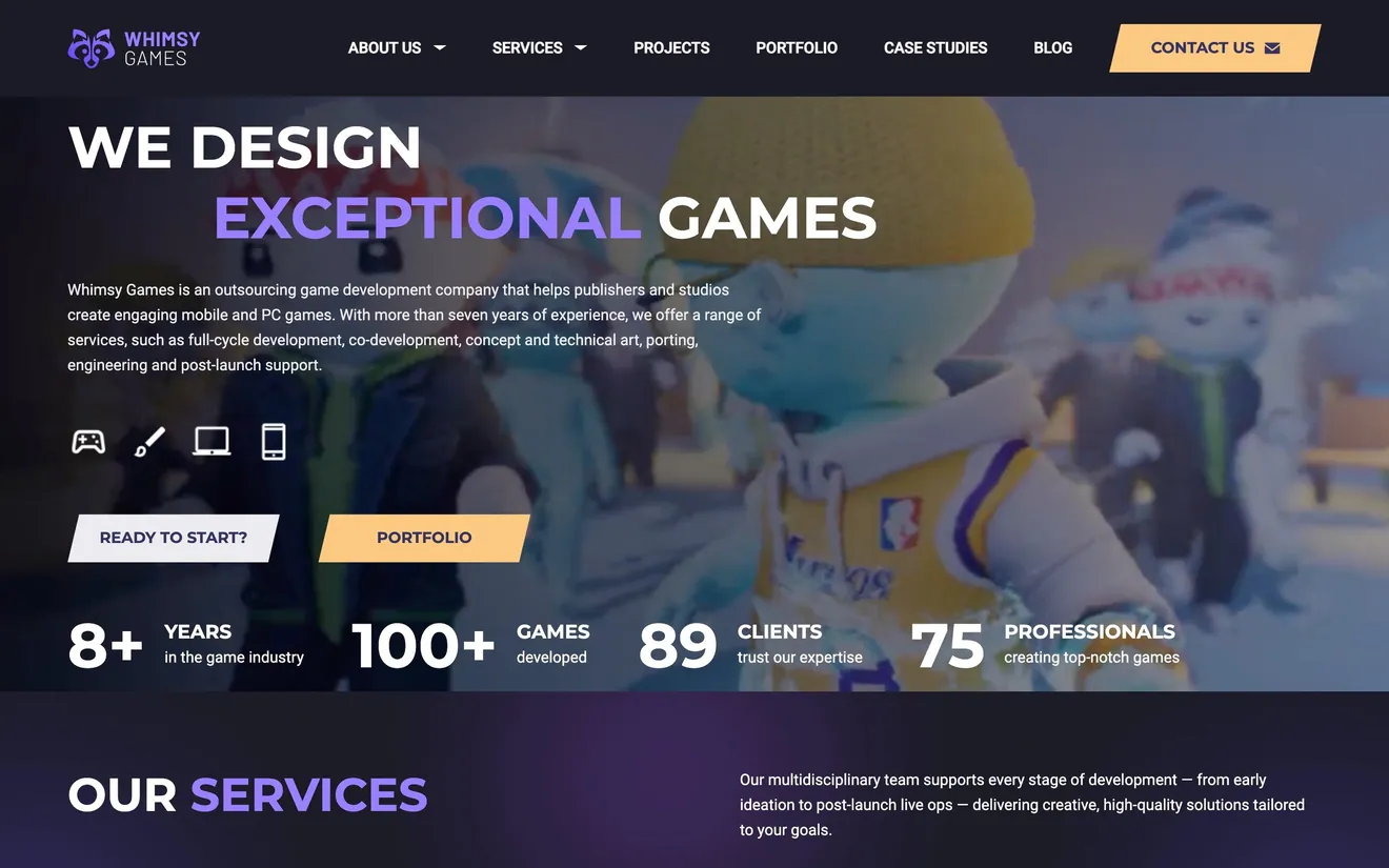
whimsygames.co before the redesign, captured live in October 2026.
Gamer talk for buyers: “No waiting for respawns.” “Legendary results without emptying your loot chest.” Fun to write, useless to a founder comparing three studios.
Eighteen projects in one carousel. Anyone looking for 3D characters or a casual mobile title had to scroll and guess.
“Get estimates” was a form and a button. Nothing said what happens next, or how soon.
What the deals said
Deals weren’t lost on price
An offer audit ran alongside the redesign: client calls and the history of won and lost deals. Two patterns kept costing the studio its best projects, and both are a website’s job.
Proof of niche
A buyer with a racing game shortlists the studio that shows ten cars, not the one with a hundred mixed cards. The site has to answer “have you done this?” in two clicks.
- Answered by
- Projects and portfolio, question 02 below.
Speed of the estimate
The most detailed estimates took the longest, and long silences lost the best deals. “Get estimates” needed a named promise and a clock.
- Answered by
- The brief, question 05 below.
Who buys
Two buyers who never use the same words
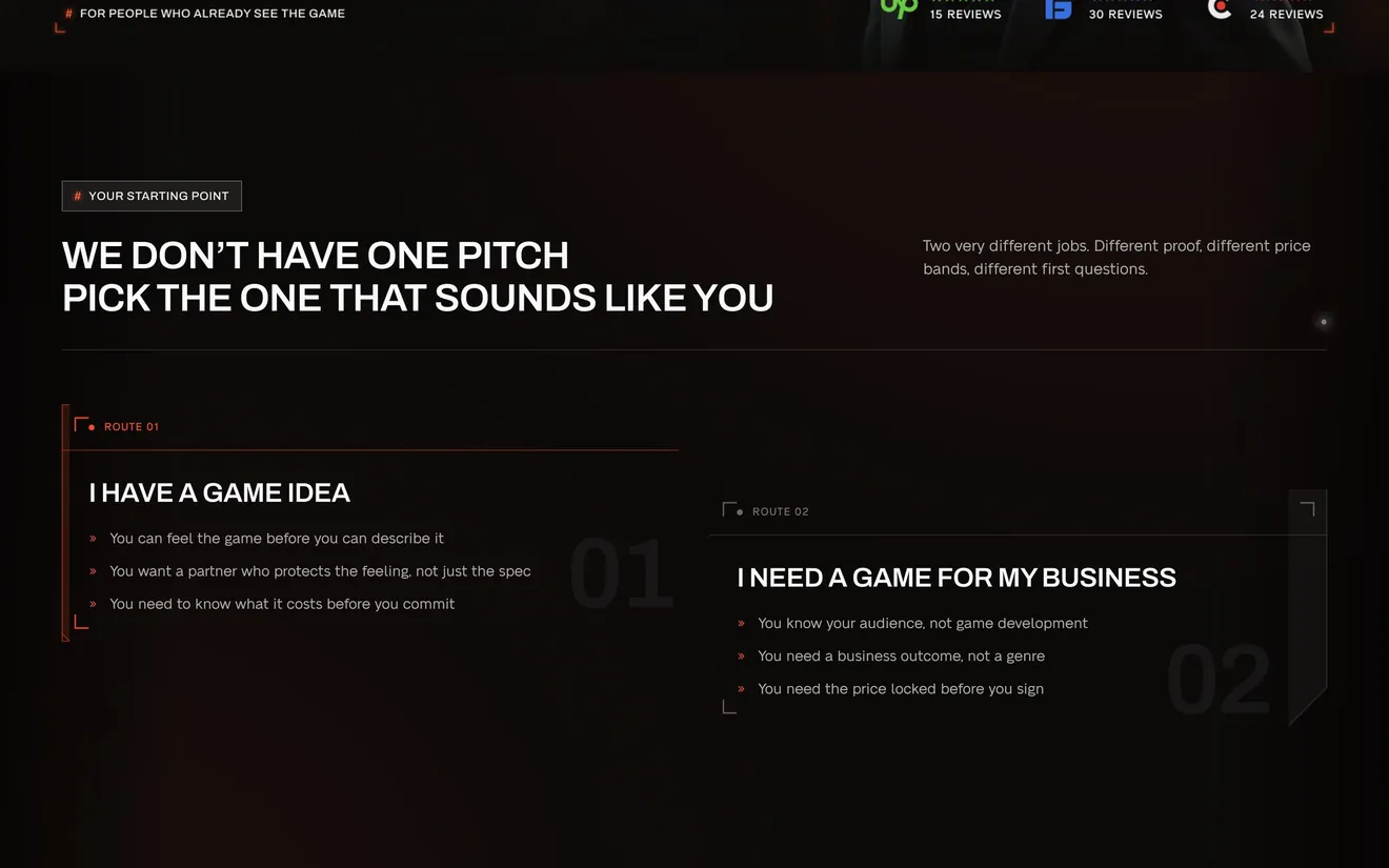
One buys a partner for an idea, the other a business result. The site stopped averaging them into one message.
The visionary
A founder who can feel the game better than they can describe it. Shortlists a handful of studios and picks the one that gets the idea.
- Wants
- A partner who protects the feeling of the idea, and a cost before the work starts.
- In their words
- “If it makes you smile when you open the game, that’s success for us.”
- Answered by
- Route 01, “I have a game idea”, on the services page, then projects by genre and discipline.
The business owner
Runs a school, an agency or a creator brand and wants a game to reach a business goal. Knows the audience, not how games get made.
- Wants
- A result without becoming an expert in games, and a price that stays the price.
- In their words
- “We want to turn our audience into revenue.”
- Answered by
- Route 02, “I need a game for my business”, budget bands in the brief and a reply in one business day.
Tone of voice
Play lives in the form,
not in the copy.
The game feeling stayed in the cut corners, the light and the raccoon. It left the promises: every claim on the new site is something a producer could hold the studio to.
| Old voice · whimsygames.co | New voice |
|---|---|
| We hold the date we quoted. | |
| 48 hours to a scoped estimate. | |
| Built for the platform, not ported to it. | |
| The team stays after launch. |
The home page
Four blocks that carry the home page
Out of twelve on the page: what the studio does, the proof, the stack and the brief. Each one shown whole.
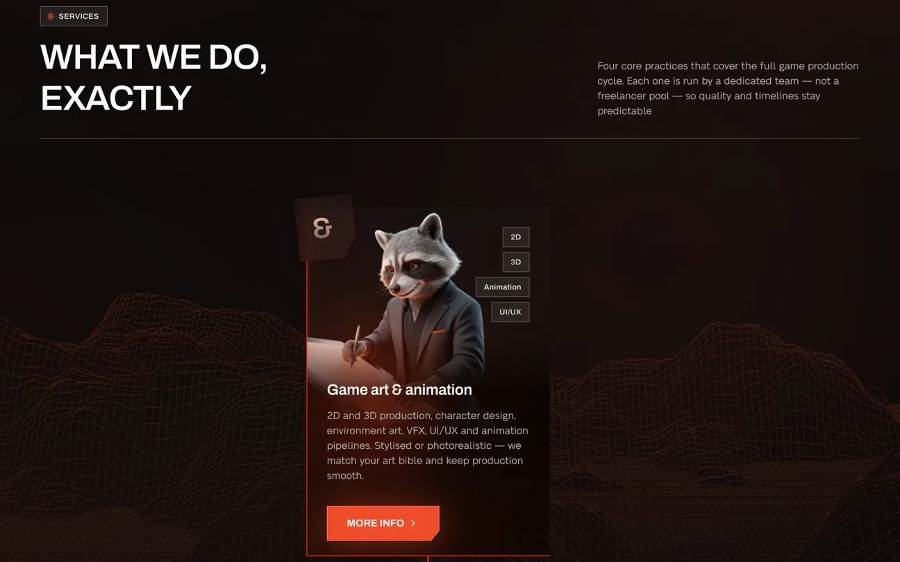
Services · one practice at a time 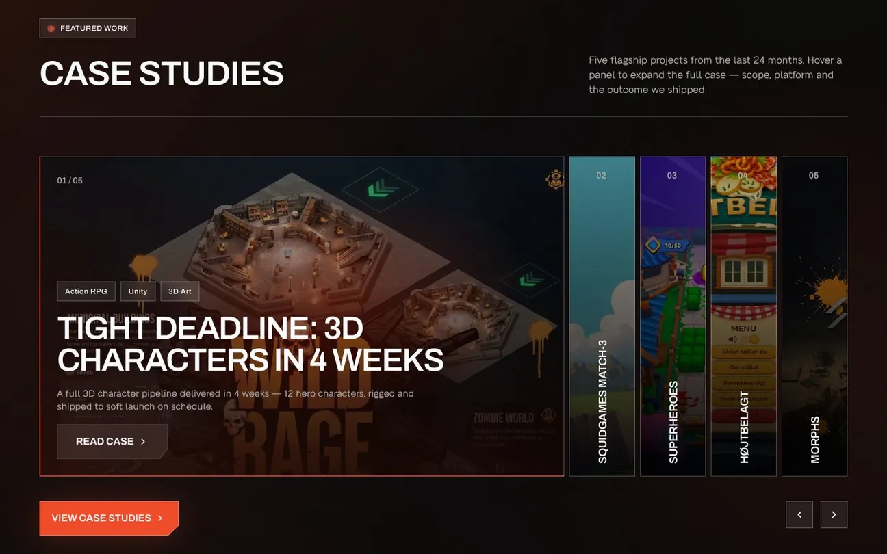
Case studies · the result on every panel 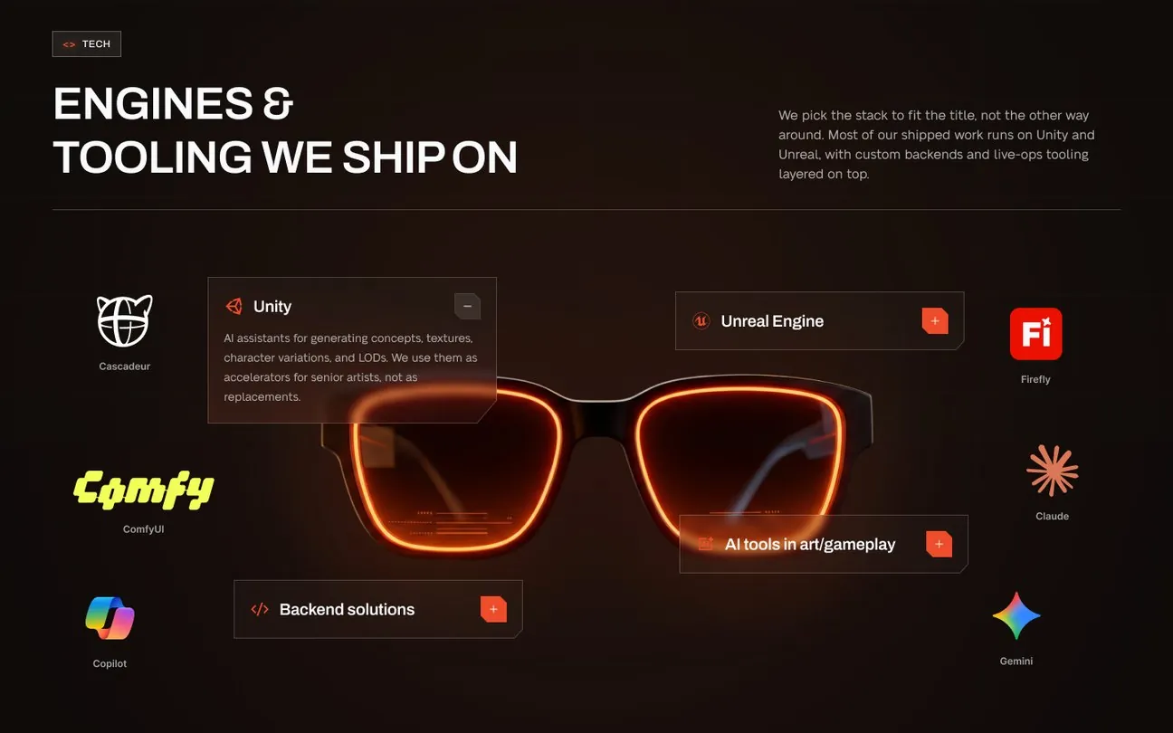
Engines and tooling · the stack around one object 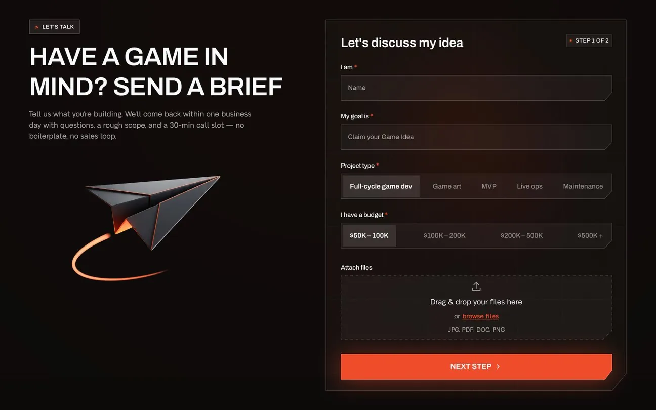
The brief · two steps, budget bands up front
Page by page
Five questions a buyer asks before the first call
Each page now answers one of them, in the order a producer or a founder asks. The old site answered none of them in the buyer’s words.
-
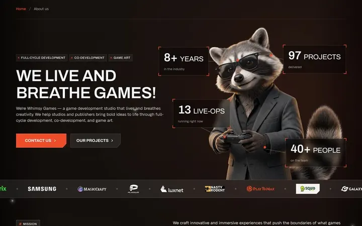
[ 01 ] Who are you, and do you ship?
Home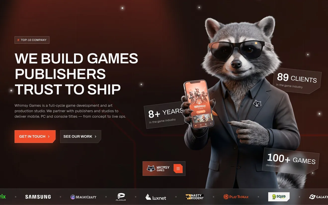
What changed
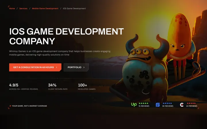
One line says what the studio is: “We build games publishers trust to ship.” Years, games and clients sit beside it, and the raccoon host stays. Below: services one card at a time, featured work, five production phases with their timings, and the brief.
What we will read after launch
First screen → projects
-
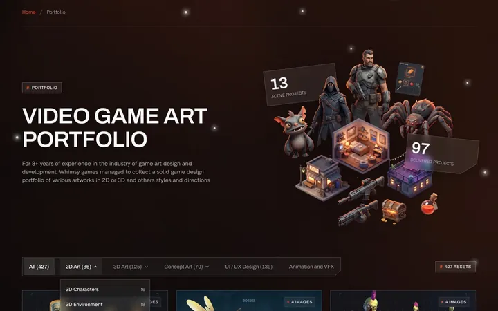
[ 02 ] Have you done this before?
Projects & portfolio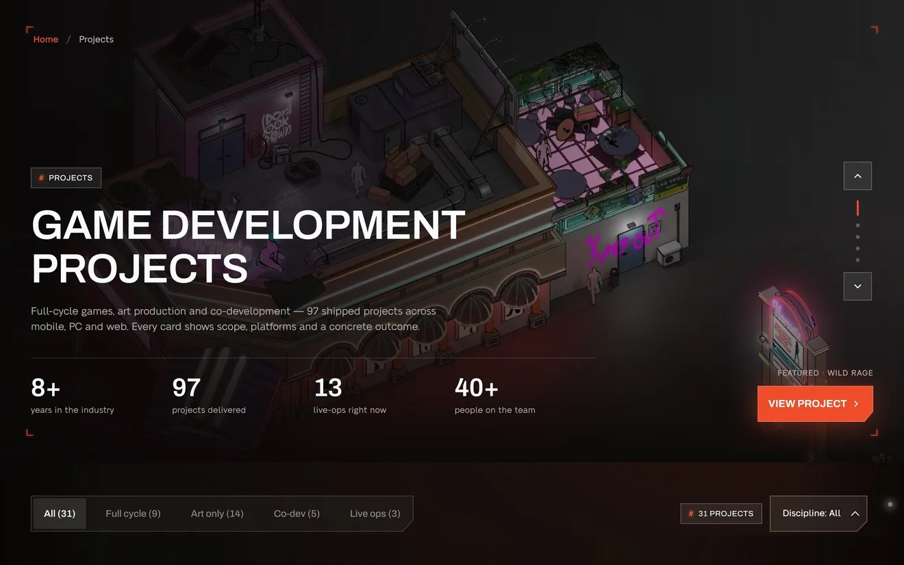
What changed
Projects filter by how you would work together: full cycle, art only, co-development, live ops. Then by discipline, from characters and environments to VFX and porting. Every tab shows its count, so nobody clicks into an empty room.
What we will read after launch
Filter used → project page
-
[ 03 ] How did it go for a project like mine?
Case pages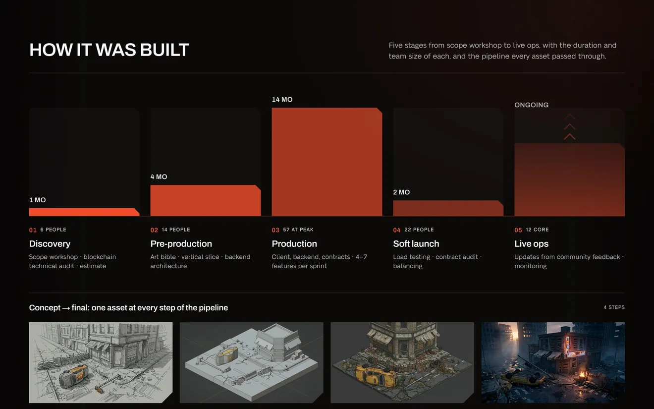
What changed
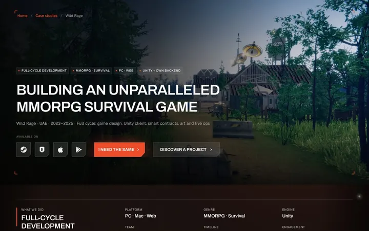
A case reads like a production report: a passport of facts, the brief before and after, how long each stage took and how many people it needed, one asset from sketch to in-engine, and results against the plan.
What we will read after launch
Case page → brief
-
[ 04 ] Do you make my kind of game?
Services & menu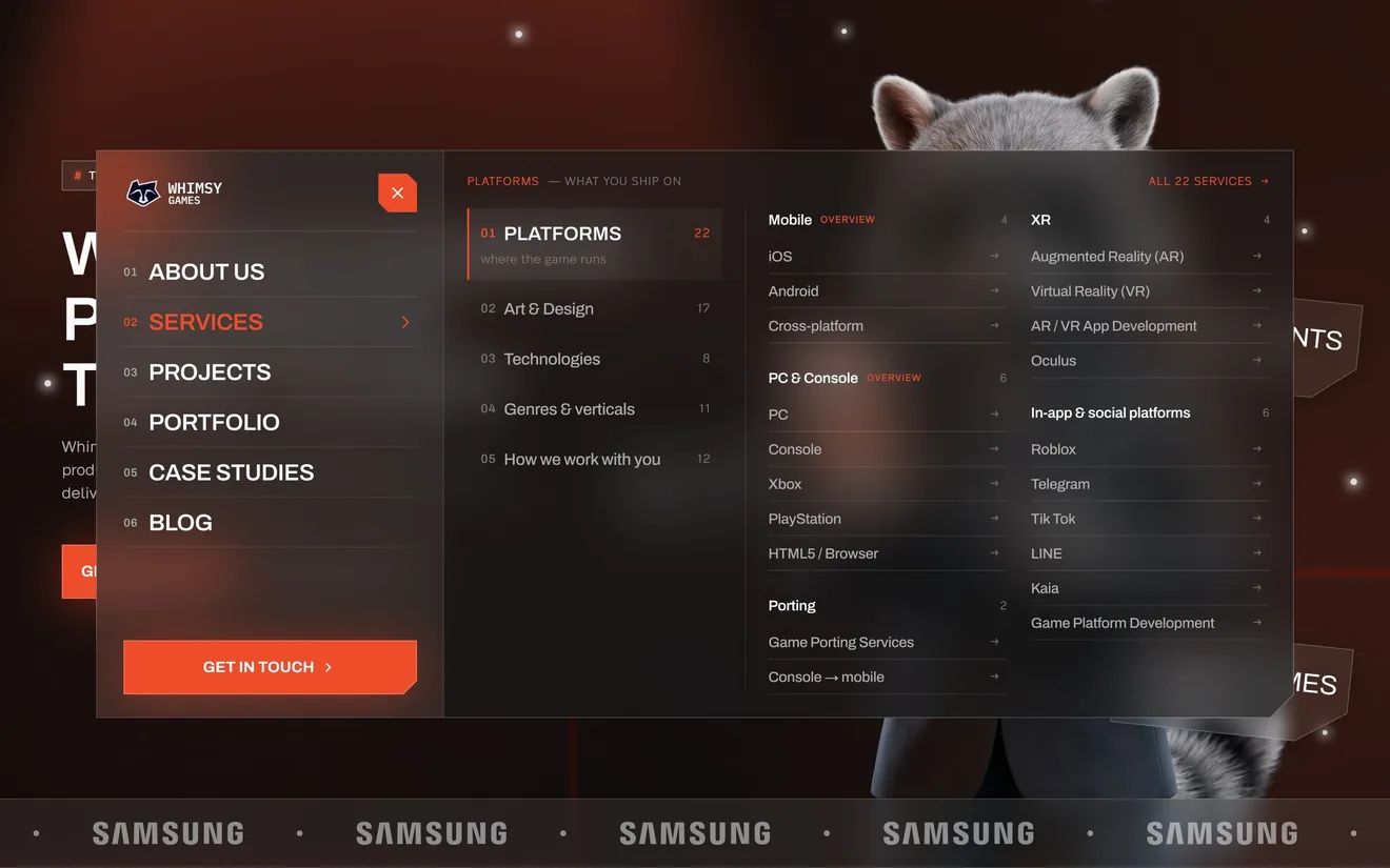
What changed
Seventy live service pages sat behind three tabs, some listed twice. Now they sit in five groups, in the order a buyer thinks: platform, art, technology, genre, working model. Every page is one click from the menu, and every URL kept its name.
What we will read after launch
Menu → service page
-
[ 05 ] What will it cost, and how soon?
The brief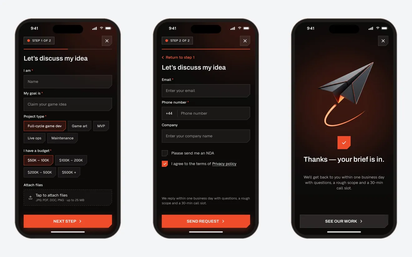
What changed
“Get estimates” became a promise with a clock: a free consultation in 48 hours and an NDA before the first call. The brief takes two steps, with chips instead of dropdowns and budget bands up front. The last screen says what happens next.
What we will read after launch
Brief started → sent
The rest of the site, one set of rules
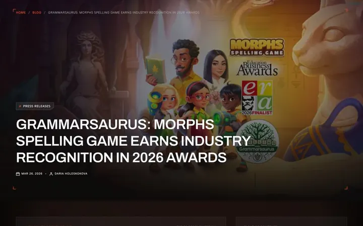
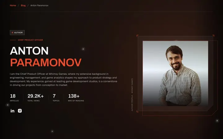
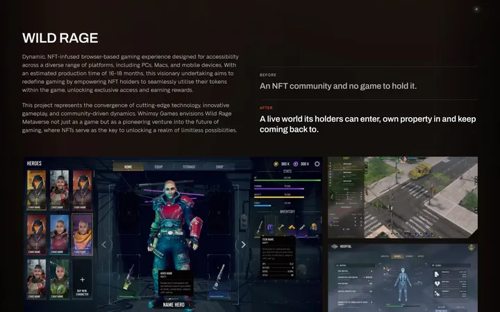
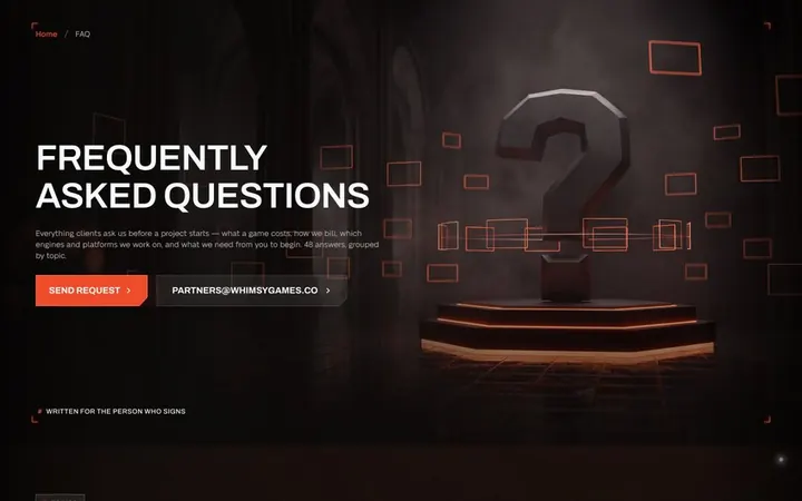
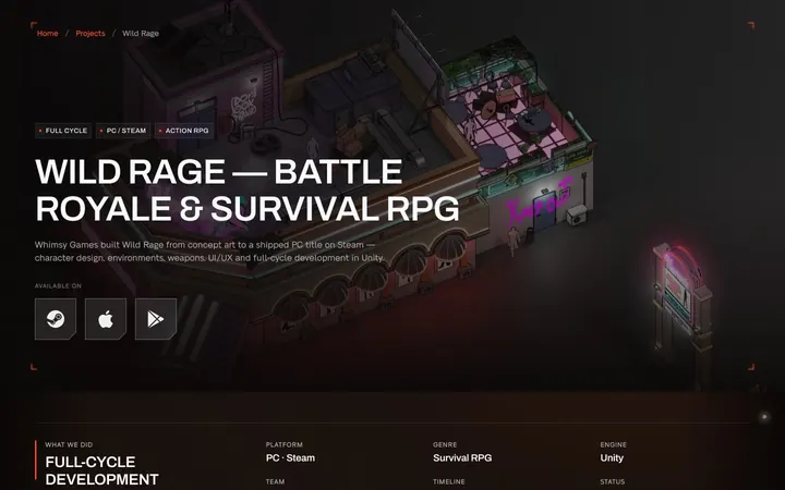
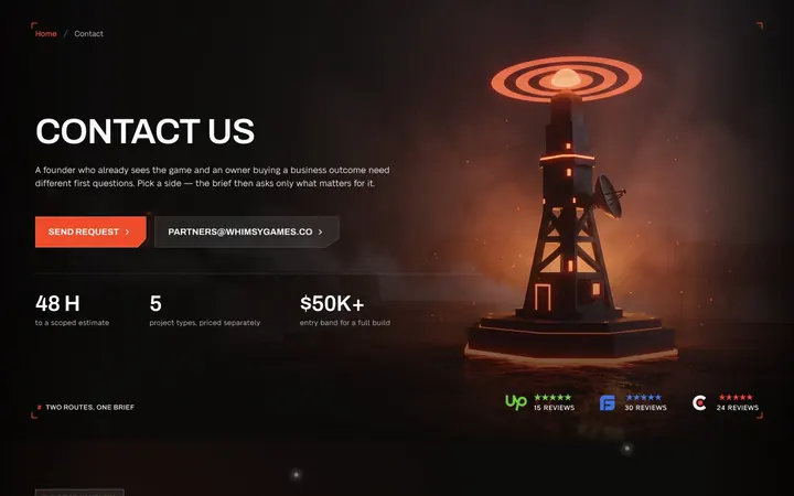
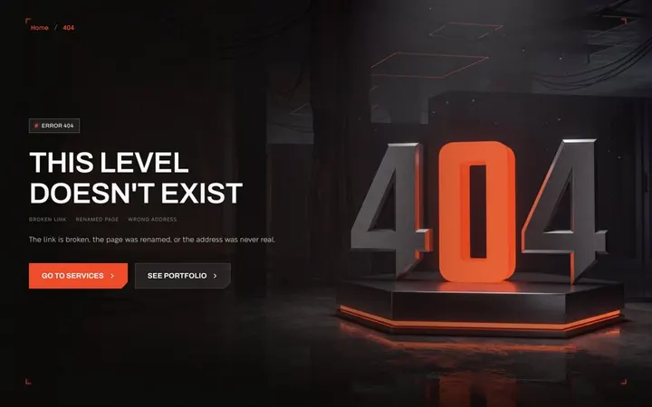
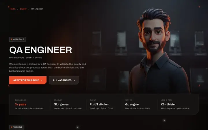
About, blog, careers, FAQ, privacy, a 404 and the pages behind each question above. Same plates, same brackets, same type.
How it looks
Playful in form.
Serious about the deal.
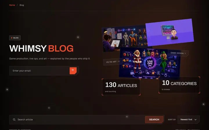
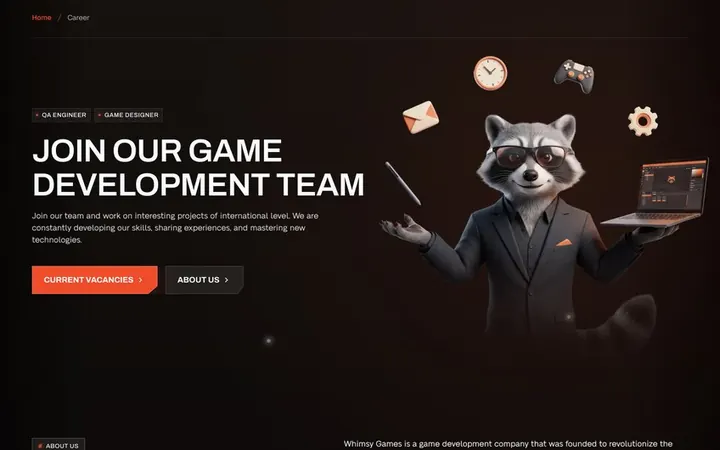
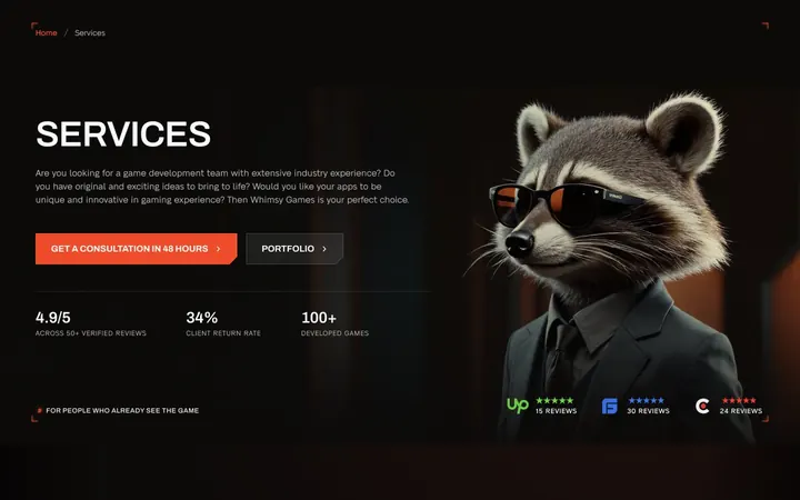
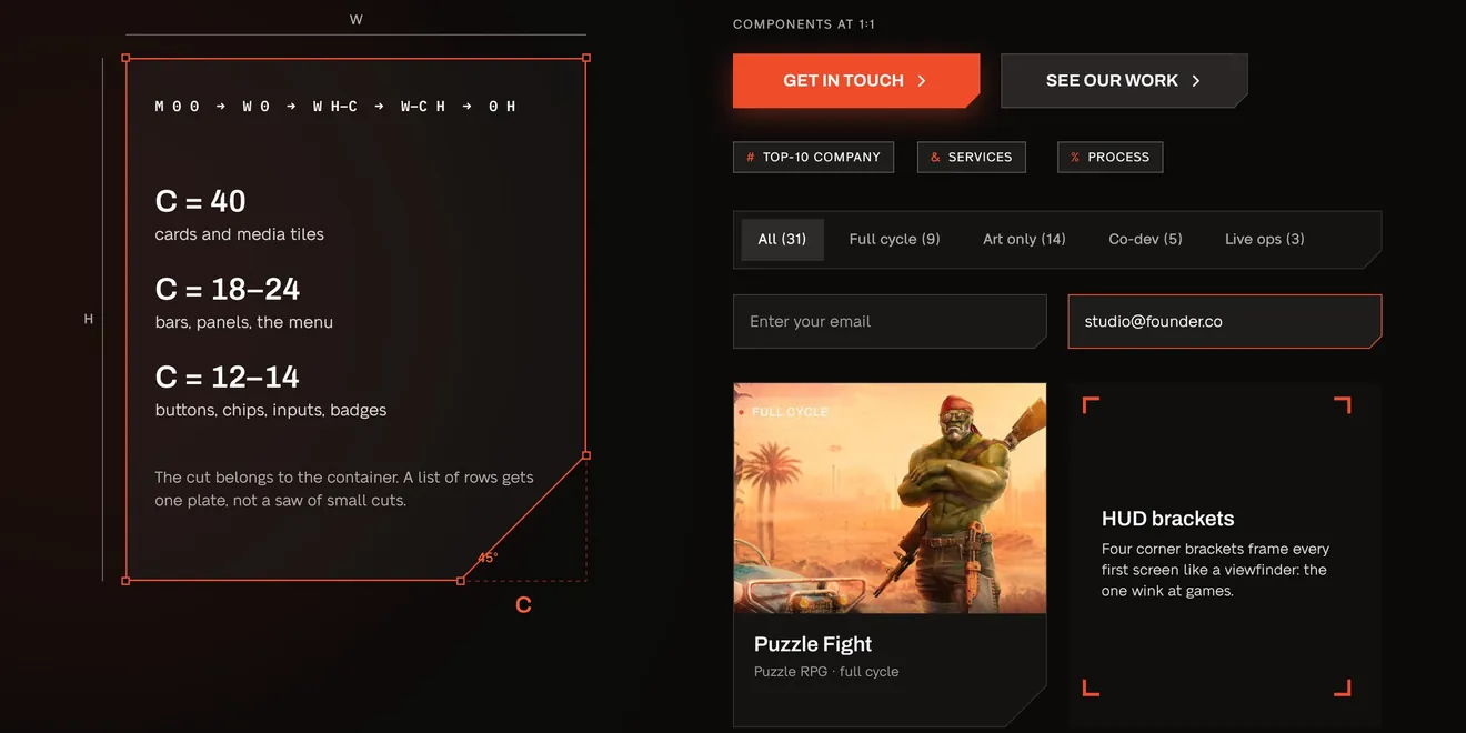
The system is cut from one shape: a plate with its bottom-right corner sliced at 45°. Cards, buttons, inputs, filter bars and the menu use it, with one ember accent and corner brackets on first screens. Not one rounded corner.
The raccoon kept his job
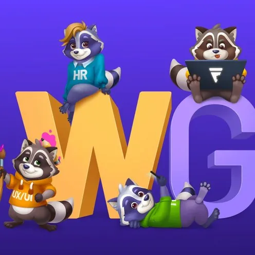
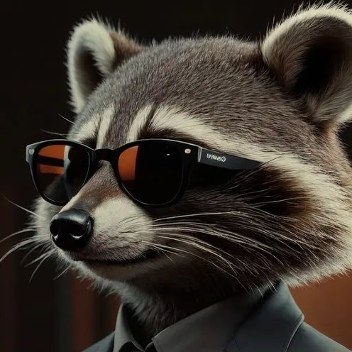
He was already the studio’s mascot, a flat cartoon on purple. He got a suit, real light and a role on every page.
Before
The sticker
Flat, on the old brand purple.

Services
The artist
At the desk on the game art card.
Services hero
The closer
Next to the 48-hour offer.

FAQ
The listener
Next to the questions buyers ask.

Footer
The sign-off
Points to “Get in touch” on every page.
Mobile
Built for the thumb, not shrunk to fit
Seven layouts at 390: home, menu, services, a case study and three steps of the brief. Each block was redrawn for one hand, not squeezed out of the desktop grid.
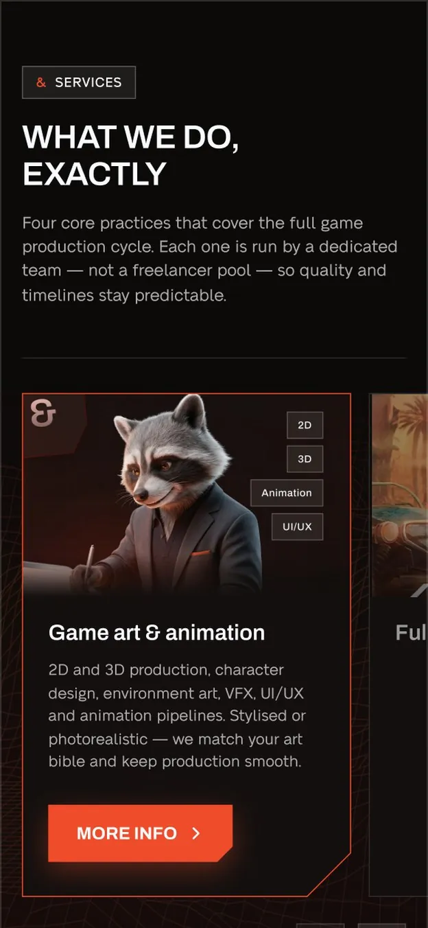
Home · services, one card at a time 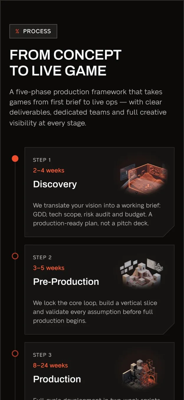
Home · process as a track 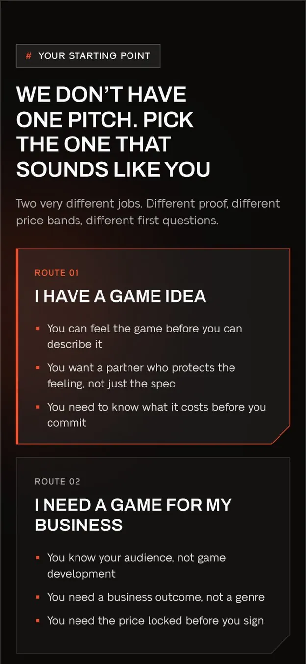
Services · two routes 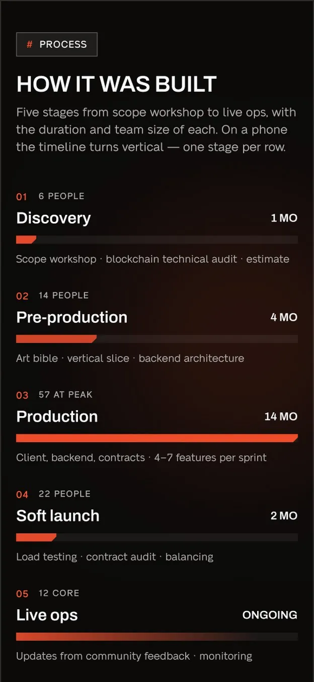
Case study · the build track
The games didn’t change. The site stopped selling them to players and started selling the studio to the people who sign.
What changed
Two routes from the first screen, seventy service pages in five groups, eight disciplines to filter the work, a 48-hour estimate, over twenty templates and seven phone layouts.
What we left alone
Every live service page kept its name and URL. The raccoon stayed the studio’s mascot; he got a suit and a job.
What we would do next
The site is in development. After launch, track brief starts and submissions, the route buyers pick and the time to the first reply.
More projects
 Corporate WebsiteGood PoliticsGood Politics runs PR and government relations for companies, NGOs and political leaders. We rebuilt its site around one rule: show the work before the promise.
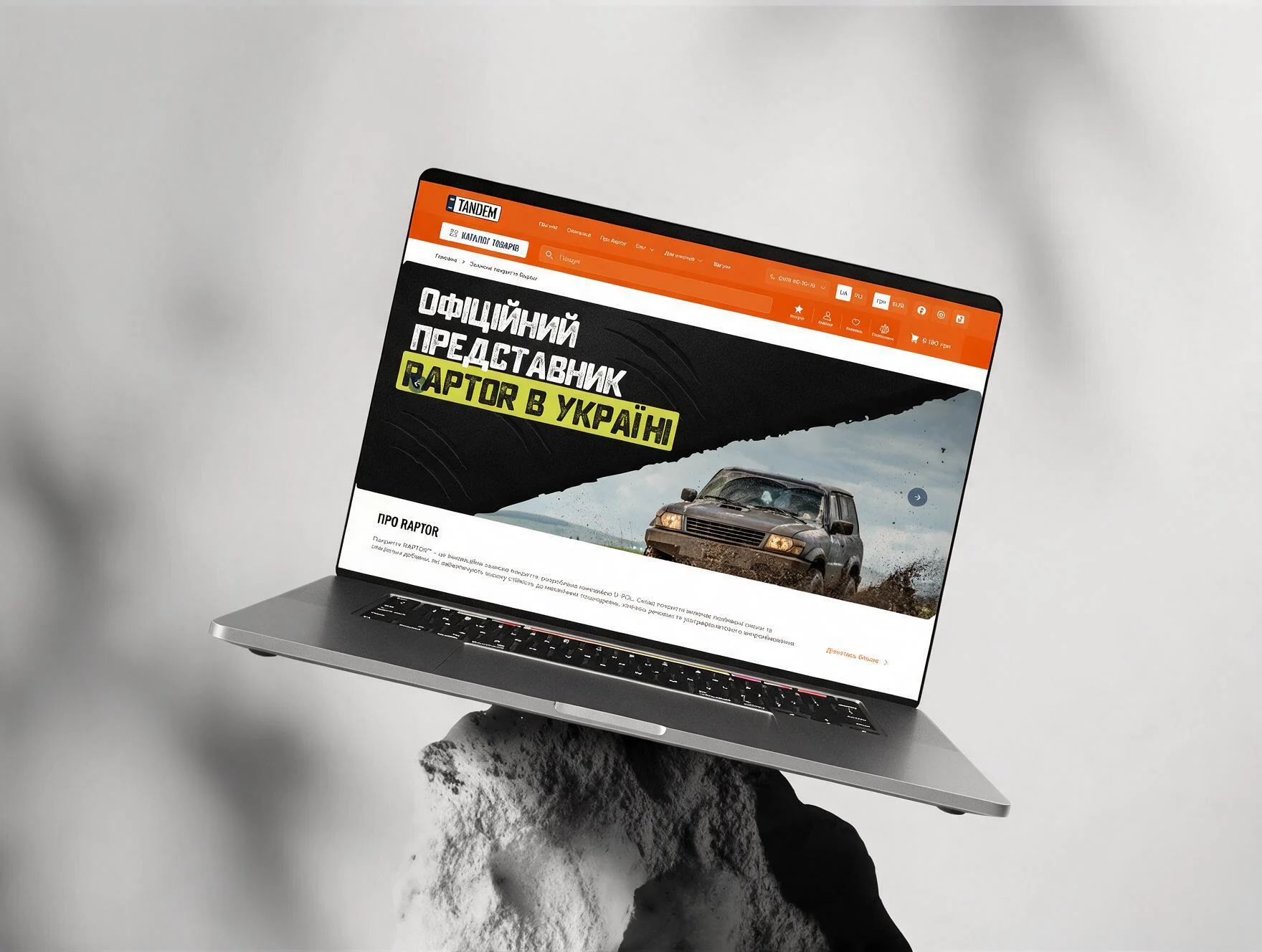 E-commerceTandemTandem is the official Raptor distributor in Ukraine. The catalogue was there. Most visitors never got to it.
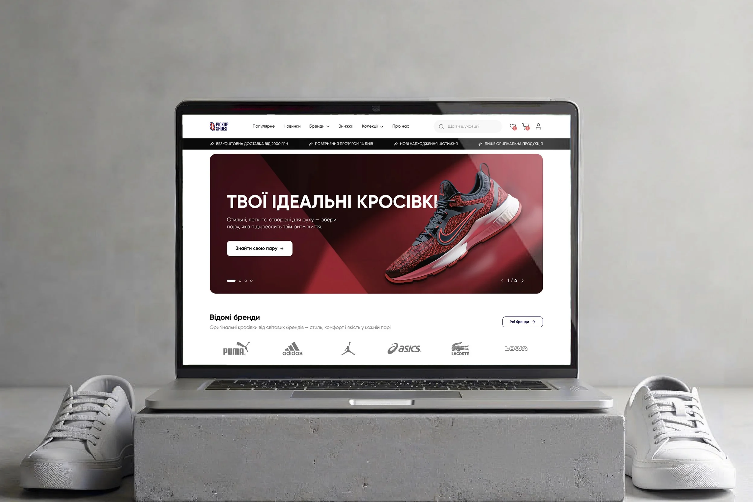 E-commercePickUpShoesPick Up Shoes sells original Adidas, Puma, Nike and ASICS from a store in Kolomyia and online across Ukraine. The stock was real; the site gave buyers reasons to doubt it.
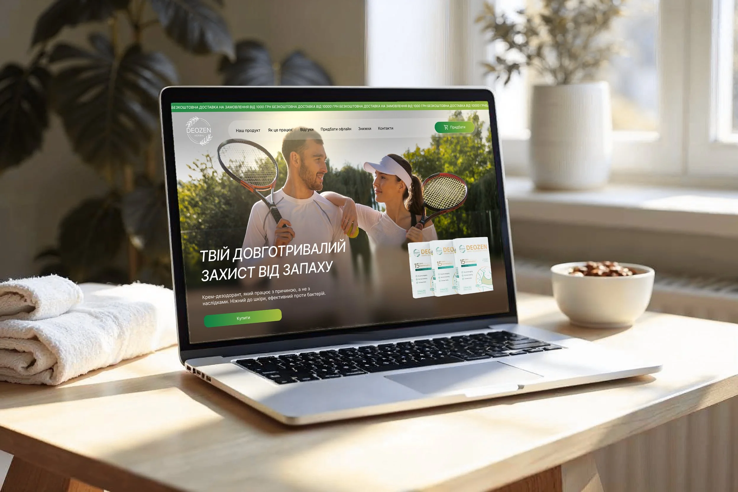 E-commerceDeozenDEOZEN sells an armpit cream that, the brand says, keeps odour away for up to 15 days after one use. To anyone with a stick in the bathroom, that sounds like a stretch.