 Product & design team
PR and GR agencies sell trust.
Online, they all look the same.
Good Politics runs PR and government relations for companies, NGOs and political leaders. We rebuilt its site around one rule: show the work before the promise.
What the new site is built around
- audiences, one site
- 3
- from discovery to handoff
- 6 weeks
- with a strategist, booked from any page
- 30 min

Service
UX/UI design & CRO
- Client
- Good Politics
- Industry
- PR & government relations
The client
A Kyiv agency that works between business, the media and the state
Good Politics builds reputations in the media and talks to government on its clients’ behalf: UPG, Proizd.ua, the Ukrainian House in Davos. Figures from the agency’s site.
- public affairs projects
- 25+
- average work with one client
- 2.6 years
- media pieces produced
- 1,500+
- countries with projects
- 8+
Who it had to convince
Three readers,
three different doubts.
A company, an NGO and a political office read the same site. Each looks for a different proof before it calls.
-
Business
“What happens, by when, and how will you measure it?”
Answered by Case pages
-
NGOs
“Whose side are you on, and how do you work?”
Answered by About us
-
Leaders
“Can this stay between us?”
Answered by A call booked in the calendar
Before and after
Same agency.
A different first sentence.
Three places where a visitor decides whether to trust the agency, word for word. The old copy is translated from Ukrainian.
| Before · the old site, 2025 | After · the new site | |
|---|---|---|
| The first lineThe old line said what. The new one says for whom. |
We create communications that set the rules We help businesses, public organizations, and political leaders build reputation, establish dialogue with authorities and society. |
|
| The servicesSix equal tiles became three directions, each with one object instead of a paragraph. | Government relations Crisis communications Event management Personal image Social media |
|
| A projectA name with dates became a story with a task and an outcome. | Client: International Mayors Summit. Term: 2021, 2022, 2023, 2024. |
How we ensured the adoption of the healthcare law amendment in 90 days
|



How it looks
Quiet confidence
and weight.
The task we set after discovery. Prata gives the headlines weight, IBM Plex Sans keeps the text calm, and deep red marks only what you can press.
Prata
Every headline and number. High stroke contrast and classic proportions: weight without raising the voice.
IBM Plex Sans
Body text and interface, 12 to 24 px. The calm, exact counterweight to Prata.
- Midnight Navy#000F1F
- Signal Red#AC201B
- Paper#FAF8F4
- Ink#1F1F1E
- Slate#434341
- Stone#939392
Page by page · Home
The home page
answers in order.
Who the agency works for, then the proof, then the way to start. Three screens, top to bottom.
-
[ 01 ] The first screen says who it’s for
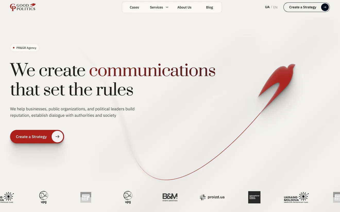
One line says what the agency does. The next one says for whom.
The swallow’s trail runs down to the client logos: proof before the first scroll.
The only red you can press. Everything else stays paper and graphite.
-
[ 02 ] Proof comes second
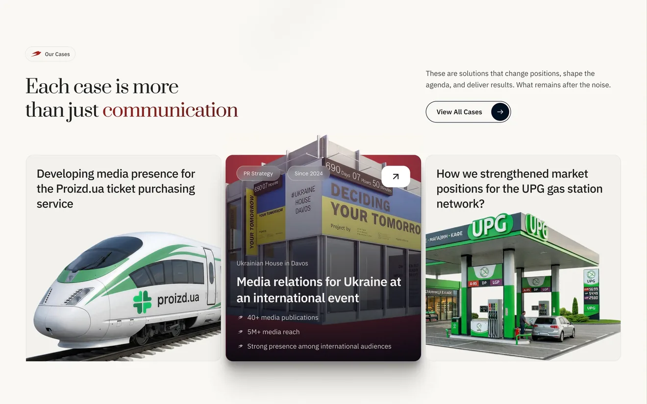
Cases start right after the first screen, not at the bottom of the page.
Each card names a client’s problem, not a service.
The numbers sit on the card, before the click.
-
[ 03 ] One way to start
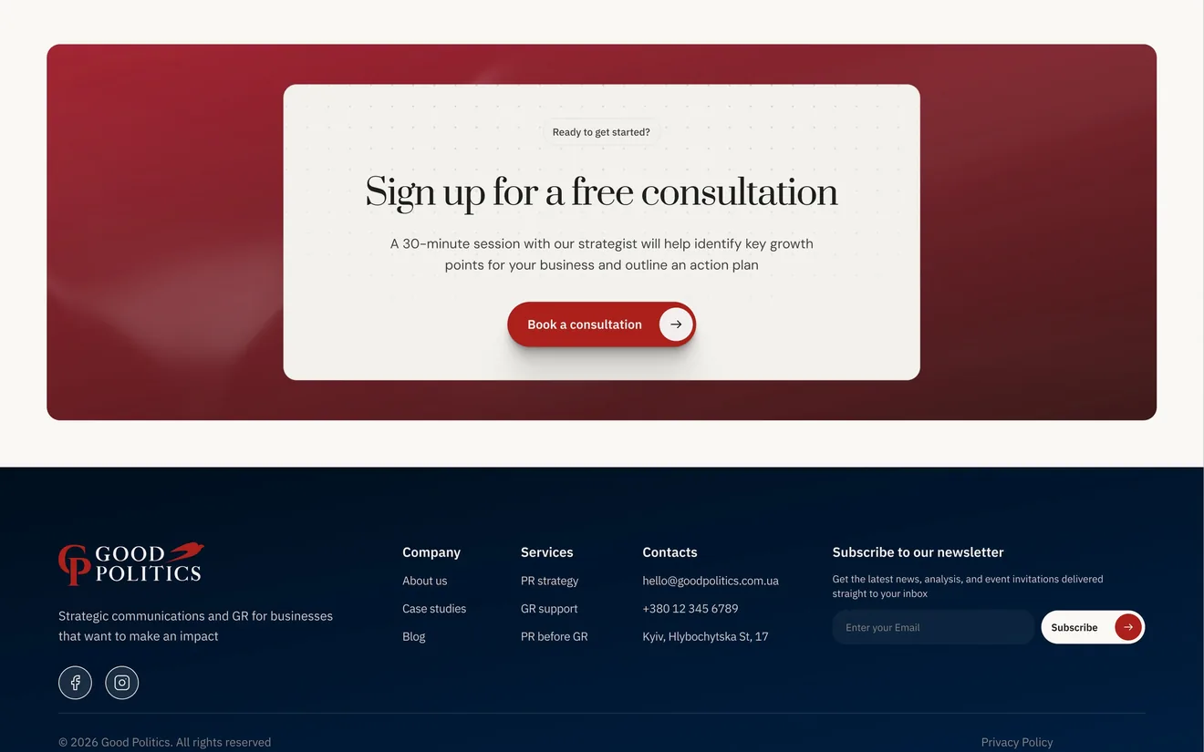
The offer is concrete: a 30-minute session with a strategist.
One button books it, and the same overlay opens from every page.
Email, phone and the Kyiv address close every page.
Page by page · Services
A service page
reads like a brief.
Three directions, each on its own page: what it is, who it is for, what changed for a client.
-
[ 01 ] A service in plain words
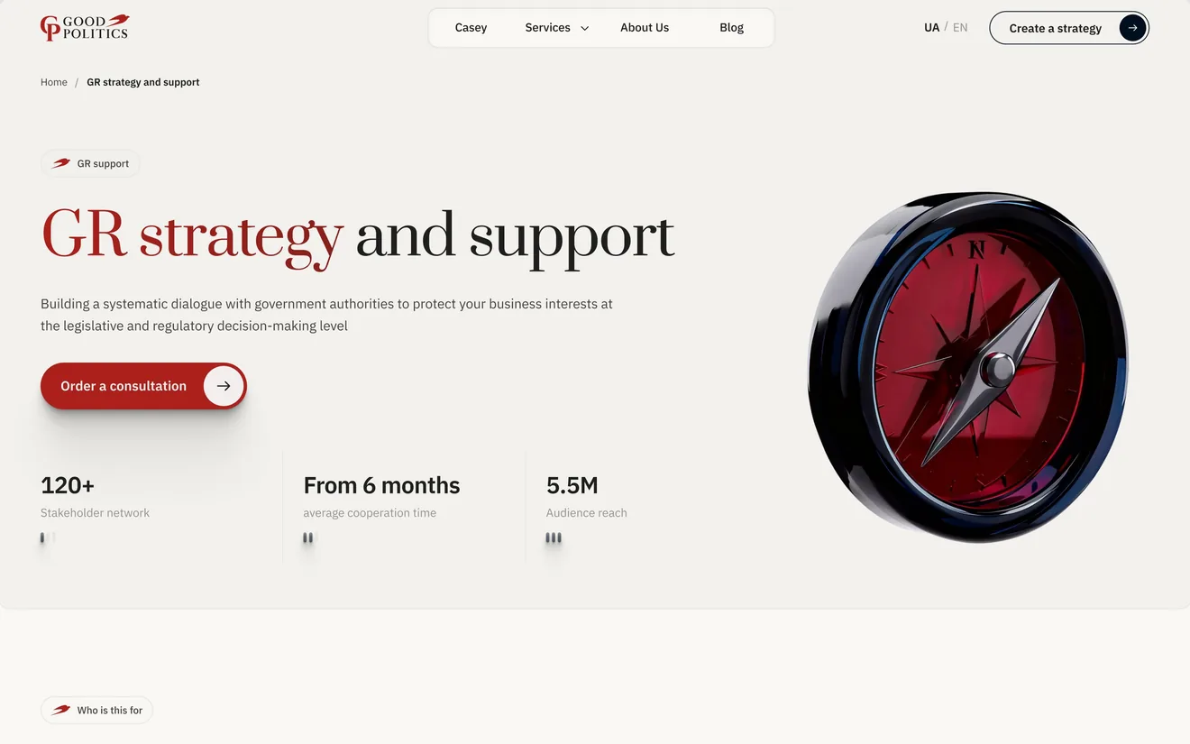
The name says what the service is; the line under it says what it protects.
One object per service: a compass for government relations.
The first screen ends with one action: order a consultation.
-
[ 02 ] The client finds their own situation
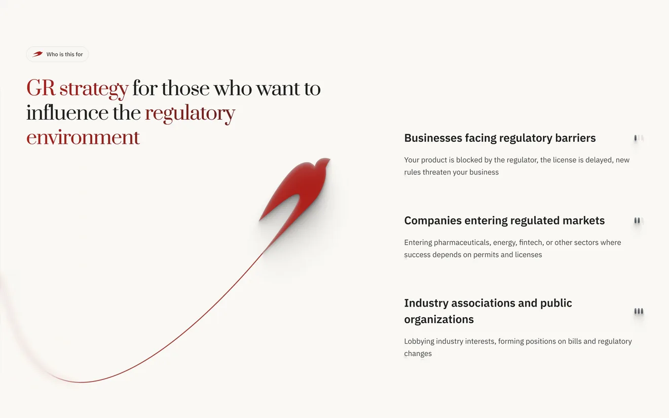
The heading names who the page is for.
Three situations to recognise: blocked by a regulator, entering a regulated market, an association with a position.
-
[ 03 ] An example instead of a promise
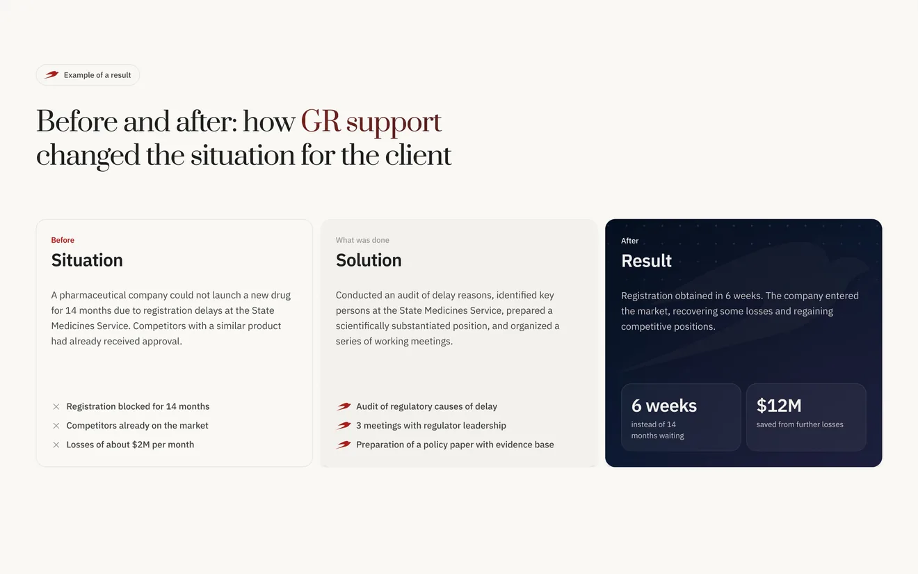
Before: the situation, in the client’s terms.
What was done: three concrete steps.
After: the result, on the dark card the eye lands on first.
Page by page · Cases
Every case
runs the same way.
From the situation to the result, so a reader can compare one case with another.
-
[ 01 ] The title is the task and the deadline
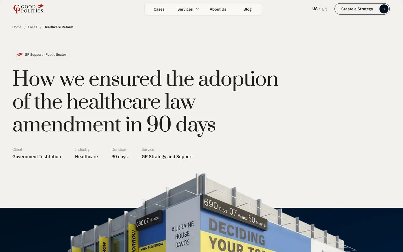
A law amendment in 90 days: the outcome and the deadline in one line.
Client, industry, duration and service sit under the title, before any story.
The image is the project itself, not a stock photo.
-
[ 02 ] The work, in three directions
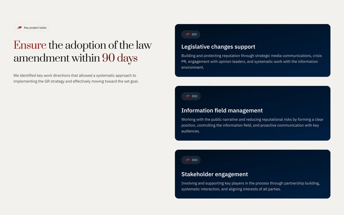
The goal repeats in plain words, with the deadline in red.
Three directions of work, each in one sentence.
Page by page · About
The people
before the promises.
The about page starts with the team, then the mission, the principles and the awards.
-
[ 01 ] The team, first
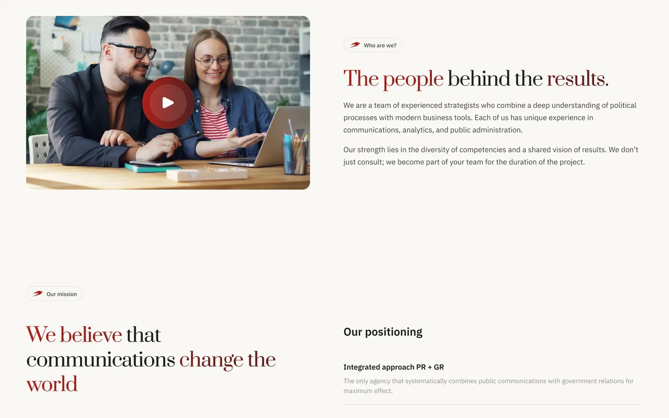
A short film of the team at work opens the page.
Who they are and how they work, in two paragraphs.
The mission in one sentence.
Page by page · Mobile
The same order,
for one thumb.
Every template was drawn at 375 alongside the desktop: the promise, the proof, the call.
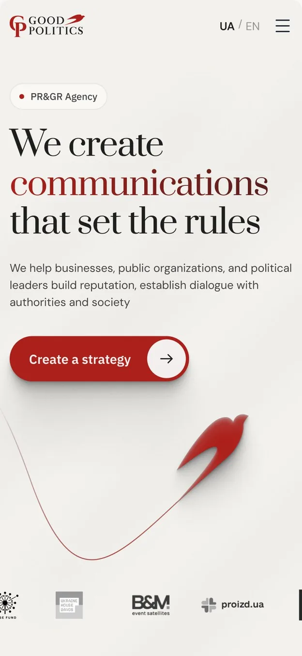
The same first line and the swallow, stacked for the thumb.
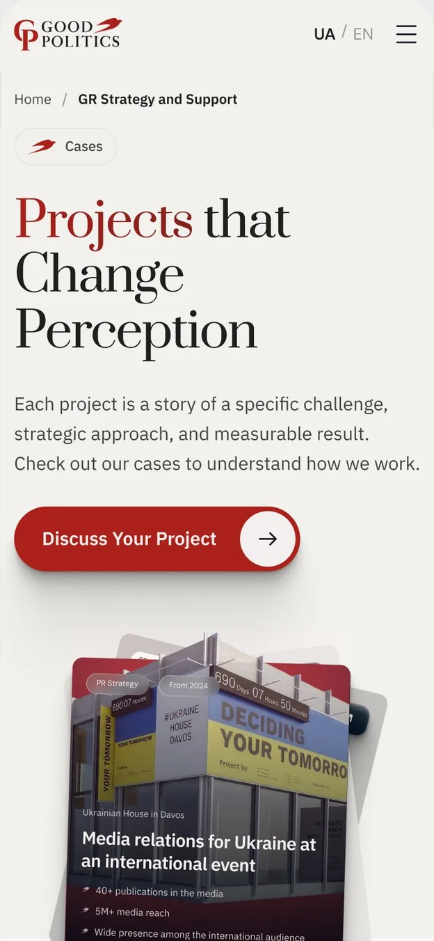
Cases as a vertical list, one story per card.
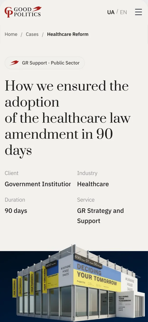
The case facts in two columns under the title.
Good Politics still sells trust. The site stopped describing strategy and started showing the cases.
What changed
Cases right after the first screen, three services instead of six, one case template, booking from every page.
What we left alone
The logo and its red swallow, the clients, the cases themselves.
What we would do next
Next, track where requests come from and how far visitors read the case studies.
More projects
 Corporate WebsiteWhimsy GamesWhimsy Games builds mobile, PC and console games for publishers, founders and brands. We redesigned its website, from the home page to seventy service pages and the brief, to look like a studio and talk…
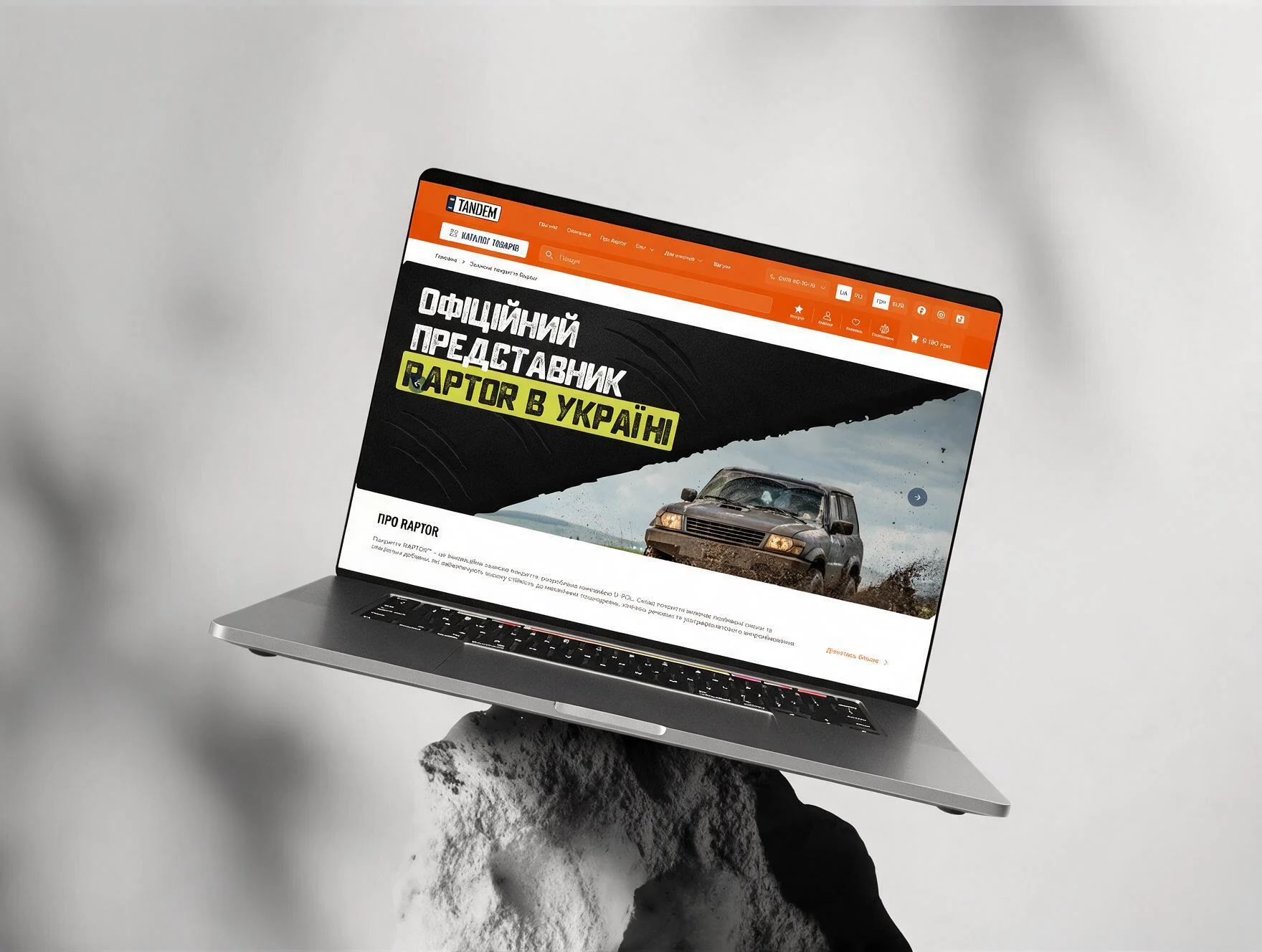 E-commerceTandemTandem is the official Raptor distributor in Ukraine. The catalogue was there. Most visitors never got to it.
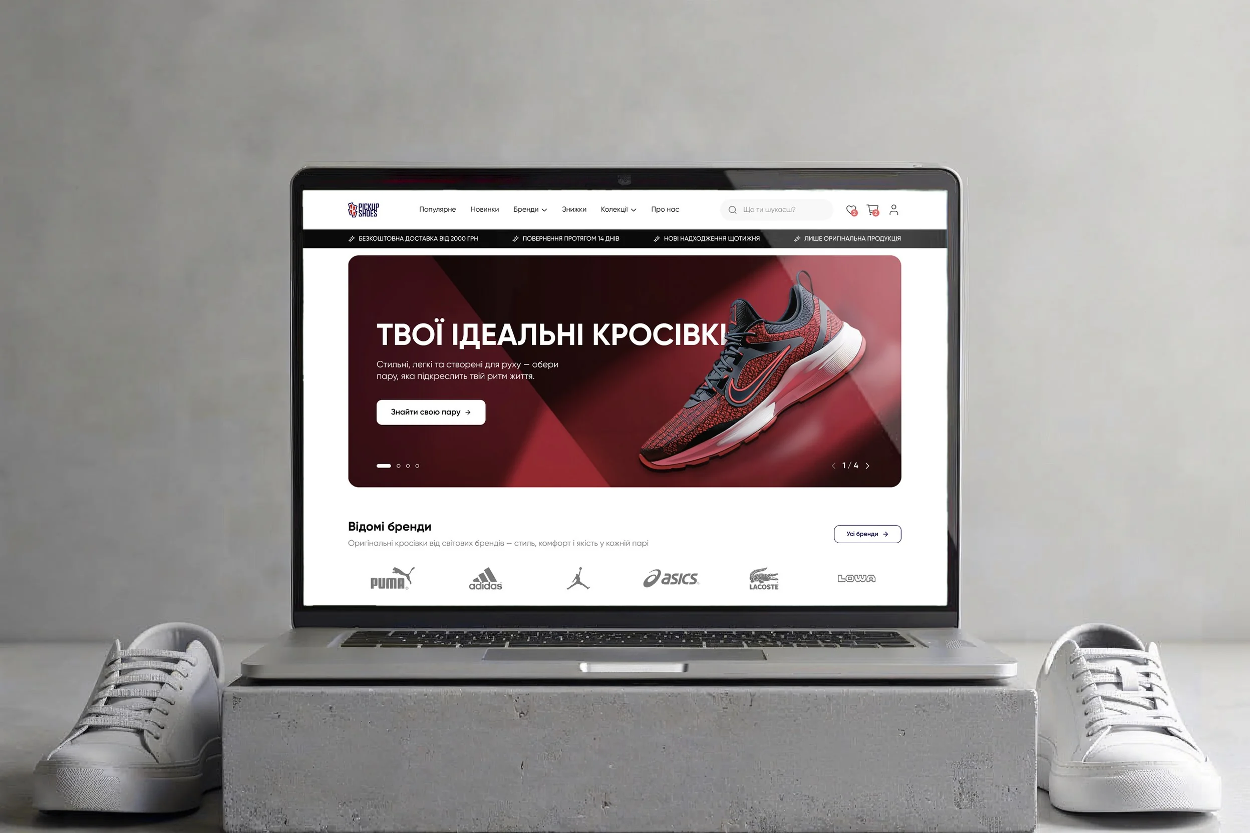 E-commercePickUpShoesPick Up Shoes sells original Adidas, Puma, Nike and ASICS from a store in Kolomyia and online across Ukraine. The stock was real; the site gave buyers reasons to doubt it.
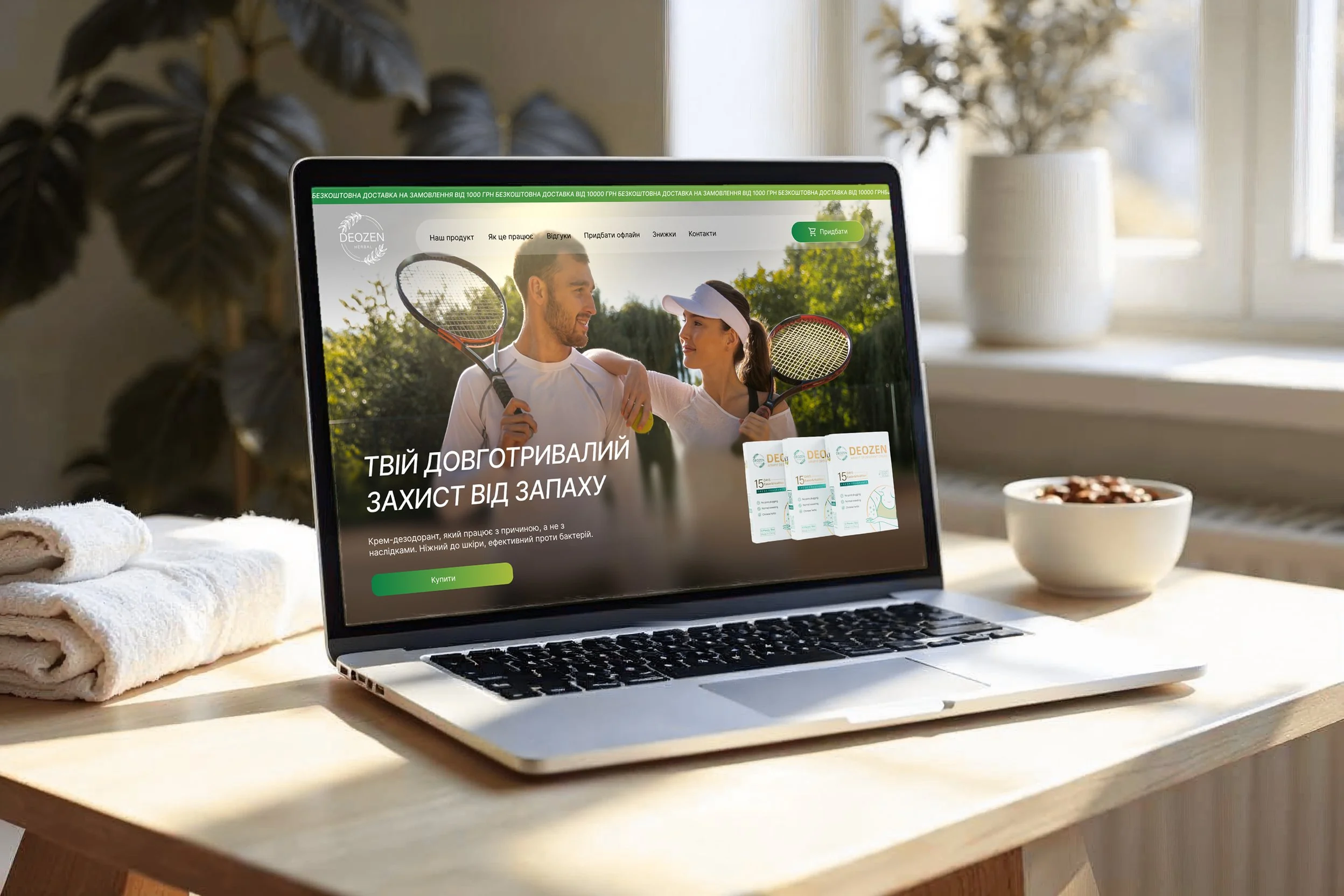 E-commerceDeozenDEOZEN sells an armpit cream that, the brand says, keeps odour away for up to 15 days after one use. To anyone with a stick in the bathroom, that sounds like a stretch.